Landeskrankenhilfe · Insurance
Two user groups, two design systems
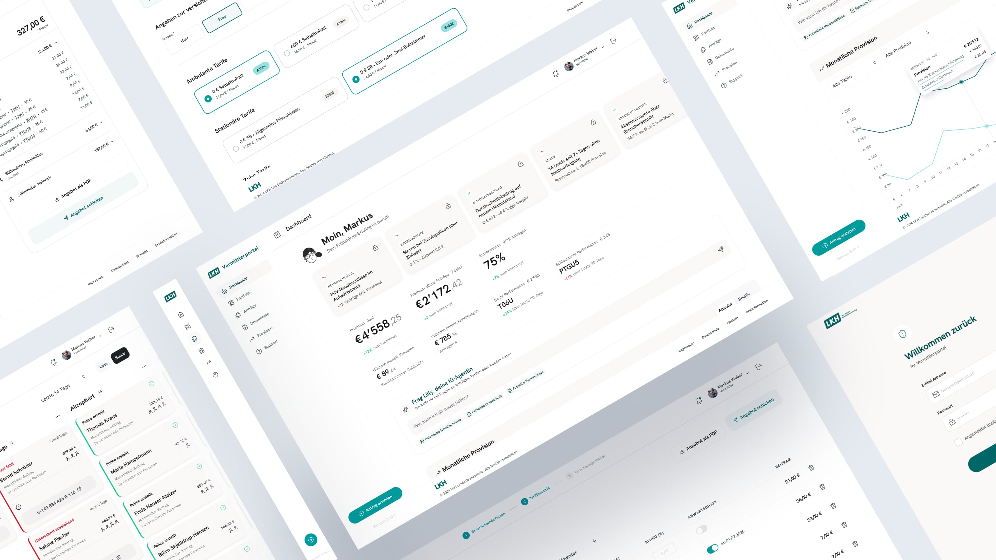
LKH's brokers had run for years on a legacy portal and the Excel sheets that grew up beside it. Every rule about a supplemental insurance application existed in several places: in the old system, in the spreadsheets, in the heads of the people on the phone. Changing one meant checking all of them. That is the surprise tax, and LKH was paying it on every product update.
The decision
The decision was not one interface for everyone. It was one design language with two design systems underneath: a dense one for brokers, who know the jargon and the edge cases and want control, and a guided one for customers, who arrive with no prior knowledge and want to be walked through. Same tokens, same components at the core, two calibrations on top. Both still look like the same company.
What the portal had to do
The broker portal had to be complete enough to replace nearly 200 brokers' spreadsheets and the legacy system in one move, or nobody would switch. And for the first time in LKH's history, customers could apply for supplemental insurance entirely on screen, without a broker in the loop.
Release 1.1
Release 1.1 came the way it always does: new tariffs, a regulatory change, a field the back office needed. Each change now lands once, in the system, and shows up on both sides. Clarification calls between brokers and LKH dropped by 65%, and an application no longer bounces between submission and decision. That is the part that stays cheap after launch.